Shooting a Comp Card
When we're shooting your headshot, the process will be very organic and spontaneous. The idea is to see your true personality in the photo. However, when shooting a comp card, the process is much more result oriented. “Look over your left shoulder and wave.” “Bring your right knee up three inches.” “Sprint past the camera.” The process is similar to a print job (but with much less pressure). Remember, we have to get 3-4 looks, plus a full headshot session, in one day of shooting. So the more specific and directorial I am, the more successful the session.
You should study comp card examples while preparing for the session. Consider your type, and select images that are consistent with your casting. Are you an ingénue, a leading lady or a character actress? Are you a leading man or a comedic actor? Make sure the photos accurately represent your type. And try for contrast. Create 3-4 different looks for one card to show versatility. For example, it’s much better to have a card with fitness, business and young mom than to have fitness, lingerie and swimsuit. Good comp cards show a range of looks.
Each shot on your card should be a lifestyle image, which tells a story and generates an emotional response from the viewer. To prepare for this, make sure to include accessories and props for each look. Accessories are an essential component to a successful lifestyle image- they help tell the story. If you're a business woman, for example, you would definitely have a nice hand bag. You may also have a pair of glasses, computer, briefcase, coffee cup, and Blackberry. The more props you bring, the more options we have when composing your shots. When reviewing my comp cards, notice how many shots use props to help tell a story. Plus it gives the actor something to do. Many photographers shoot catalogue comp cards, which aren't nearly as effective as lifestyle comp cards. But they're much easier to shoot. Basically a catalogue shot is the model standing in a pose doing nothing, and a lifestyle image tells a story.
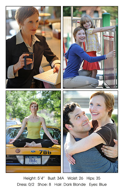
Here is a comp card example that illustrates all these points.
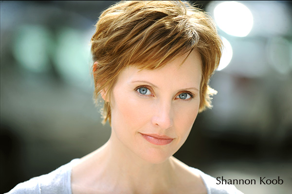
Shannon is an actress with four specific looks on the back of her card- business, young mom, fitness (yoga), and commercial. Since three of the images on the back are body shots, her cover shot is intentionally close to emphasize her face and eyes. For the back layout, it’s important that each image stand on it’s own artistically, as well as compliment the group as a whole. As we style the session, I’m considering complimentary colors, varied angles, contrasting moods and card design. Shannon's business shot is serious and confident, with waist up framing, shot from the right side of her face (props- computer and coffee mug that matches her eyes). The young mom is smiling and friendly; almost full body, looking directly at the camera (prop- young girl). The yoga shot is warm and centered, full body, straight on angle slightly from below. The commercial shot is laughing and romantic, close-up, left side of her face, shot slightly from above (prop- real life boyfriend). In addition, the placement of her boyfriend’s blue shirt below her, along with the blue sweatshirt in the shot above her, helps her eyes really stand out in the commercial shot (which is essential for close-up shots). All of these elements are necessary for a good comp card.